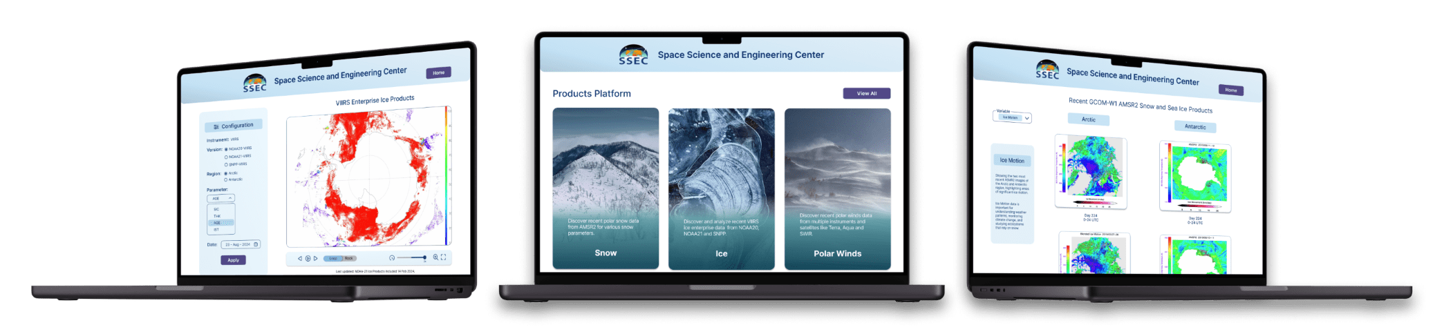
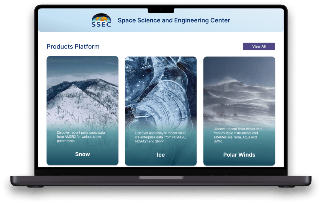
SSEC - Products Platform
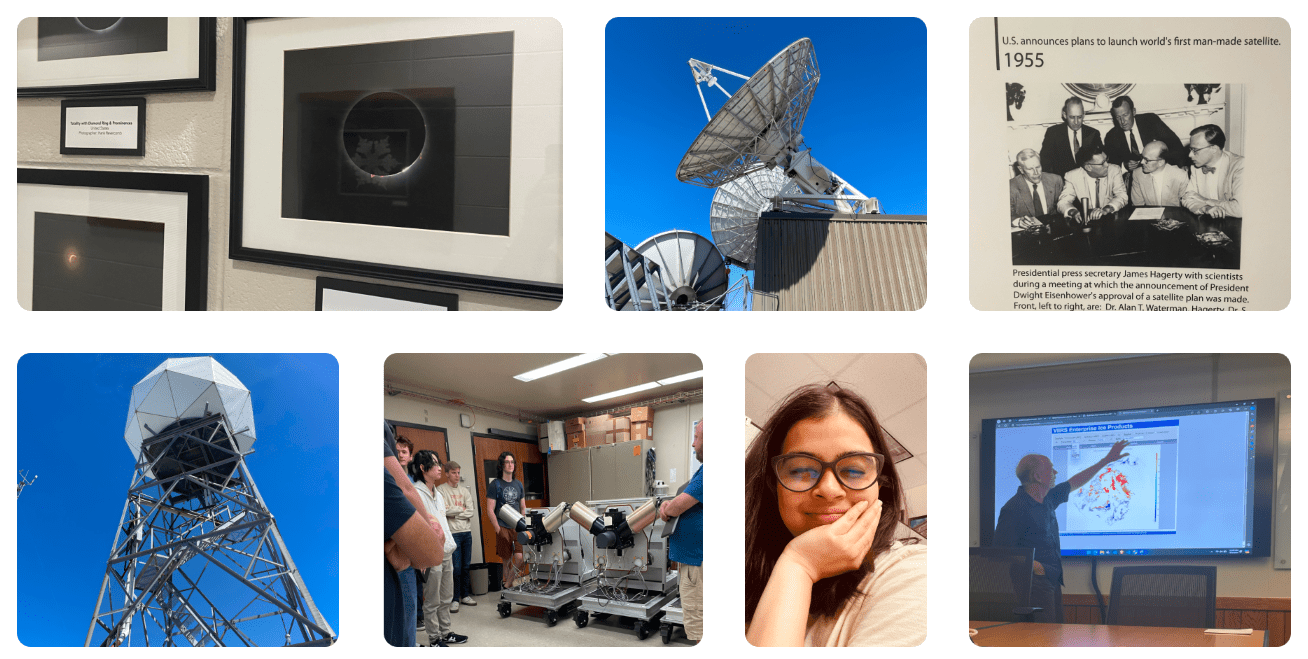
A walkthrough of my designs for Space Science and Engineering Center (SSEC), UW Madison.
Process Highlight
Design challenge and responsibilities overview
Challenge
Design a web platform to study near real-time satellite data from polar regions for climate analysis.
Opportunity
Create a platform that allows scientists to efficiently access, navigate, and compare high-resolution satellite near real-time data on snow, ice, and polar winds, while supporting data sharing and future scalability.
Timeline
Aug 2024 - Sept 2024
Disciplines
User Experience Research
User Experience Design
User Interface Design
Interaction Design
Wireframing
Prototyping
Role
UI/UX Design Intern
Tools
Figma
Slack
Problem
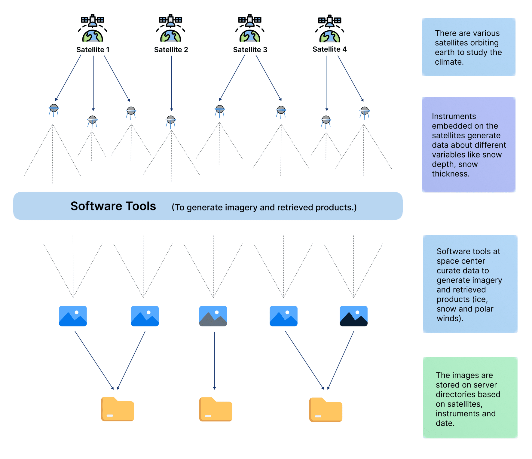
Scientists at SSEC lack a unified platform to study climate data from various satellites.
The SSEC scientists collect extensive data on snow, ice, and polar winds from various satellites and instruments in the Arctic and Antarctic regions. This data is curated and presented as images that can be generated on a daily, weekly, or monthly basis which are then closely monitored to study climate patterns. However, the current mechanism stores the images in folders and hence lacks effective navigation and flexibility for accommodating future products needed to allow for the efficient study of both recent and historical climate data and be flexible enough to accommodate future products.
Solution
Efficient categorization and navigation are key
A unified platform for climate data
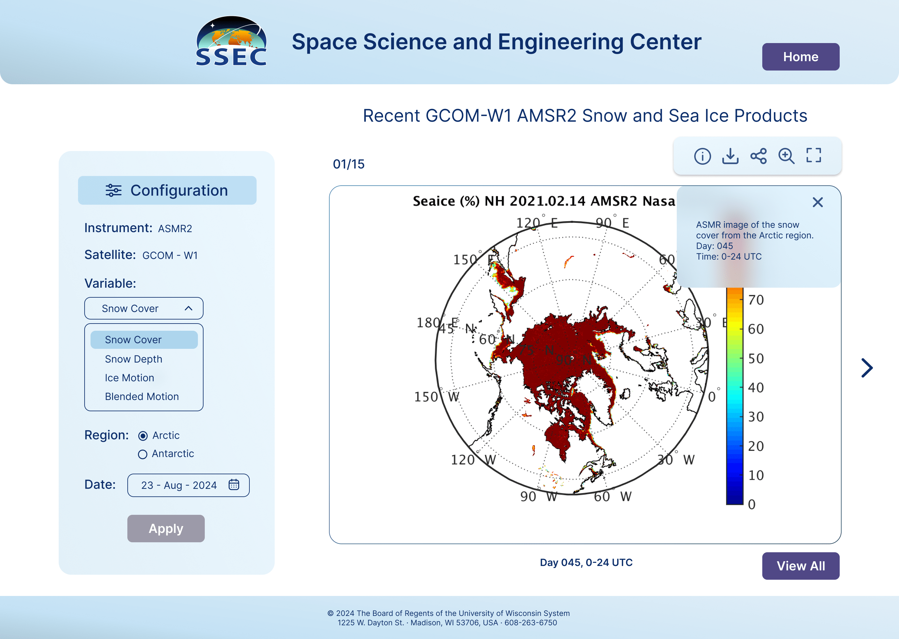
- Easy Navigation: unified, streamlined solution for accessing polar data.
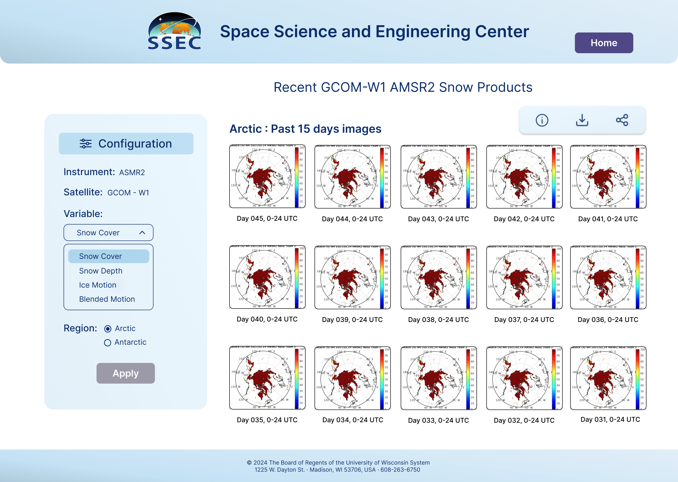
- Effective Categorization: Instead of categorizing by satellites or instruments(which grows with time), the platform focuses on environmental variables such as Snow, Ice, and Polar Winds.
- Flexible: Scalable enough to accommodate future products, ensuring the system evolves alongside advancements in climate research.
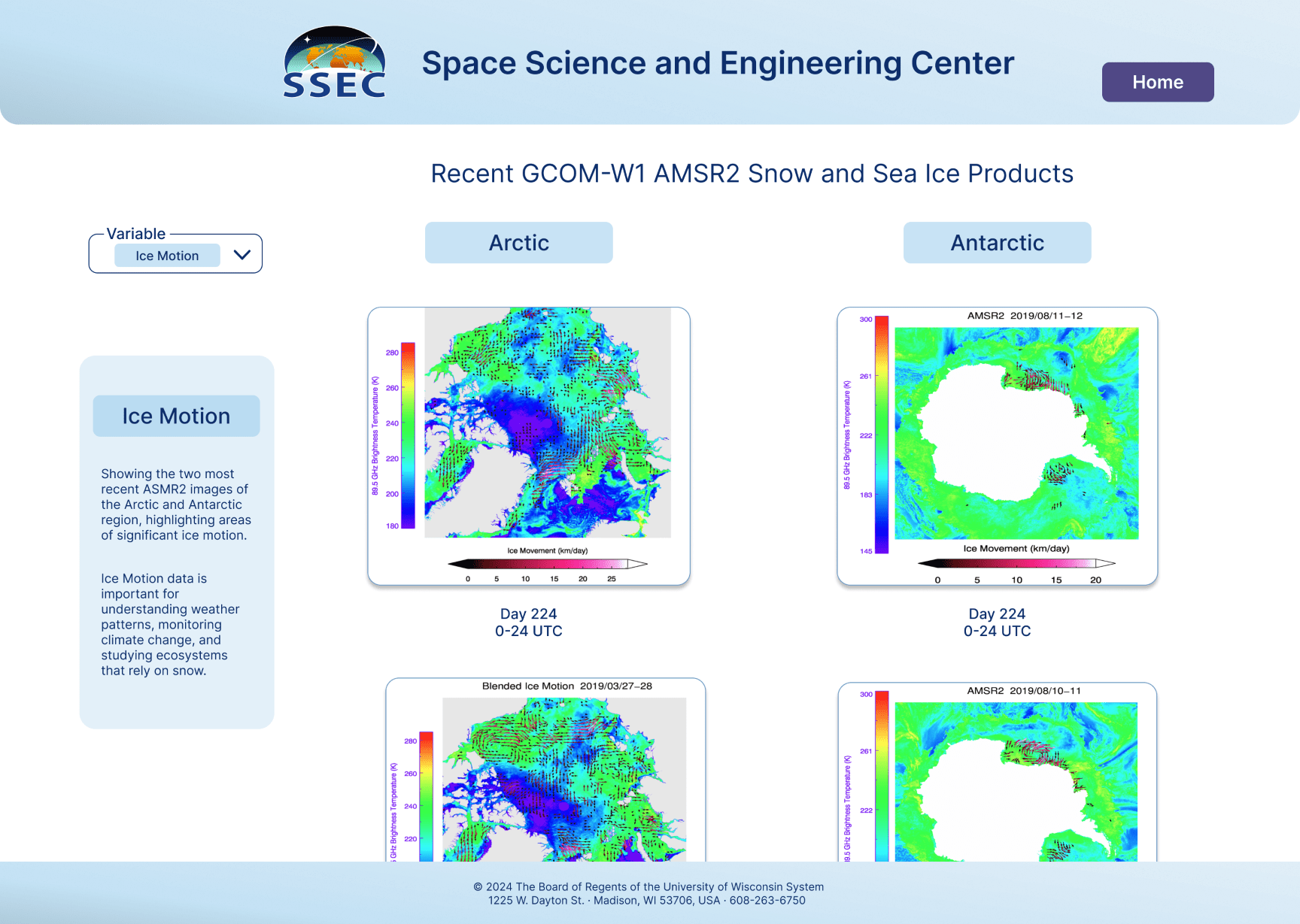
Data analysis through comparisons
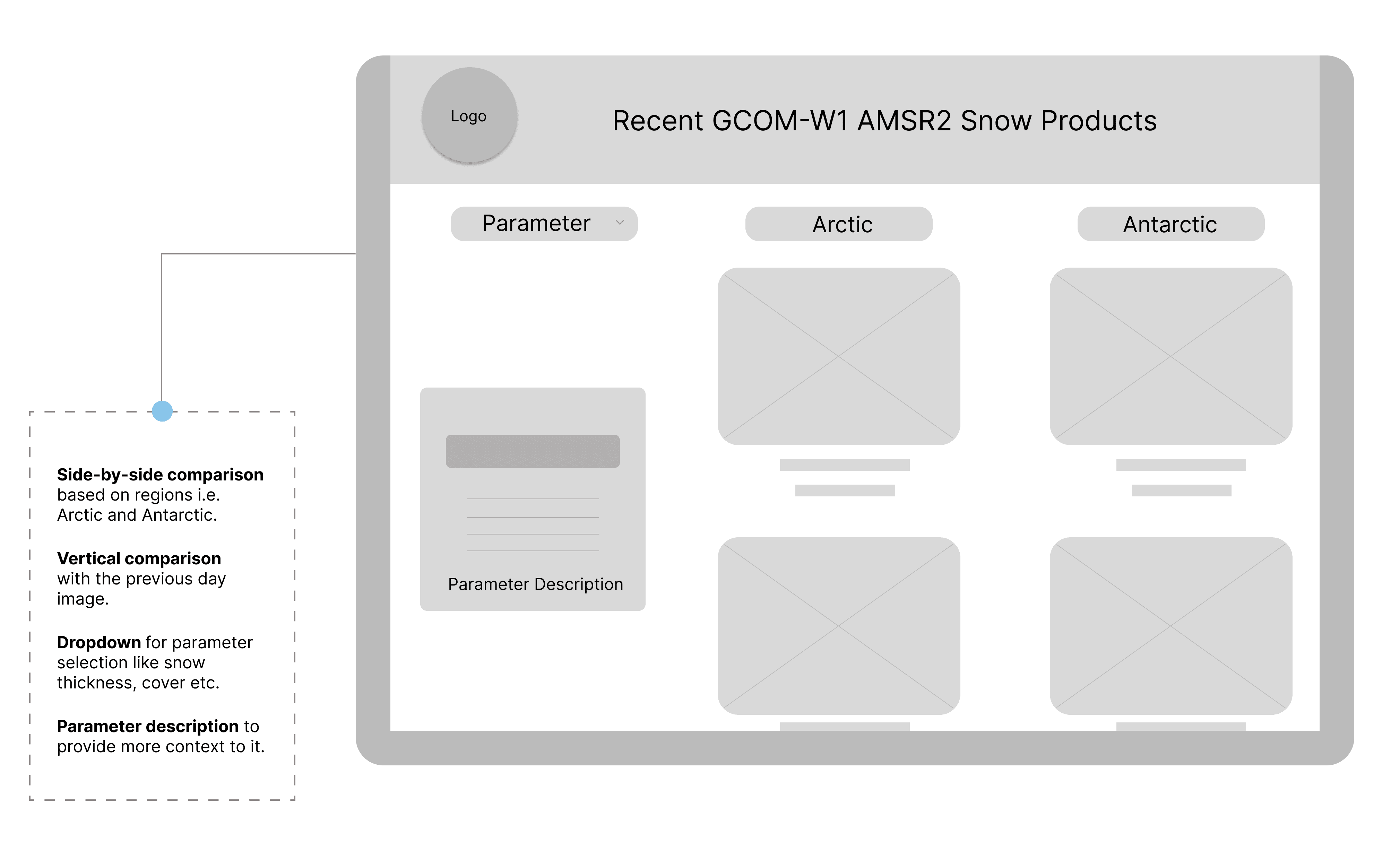
- Image data can be quickly compared based on regions horizontally for better understanding.
- Data can be also compared with previous day data.
- Filters available to select parameters for climate study.
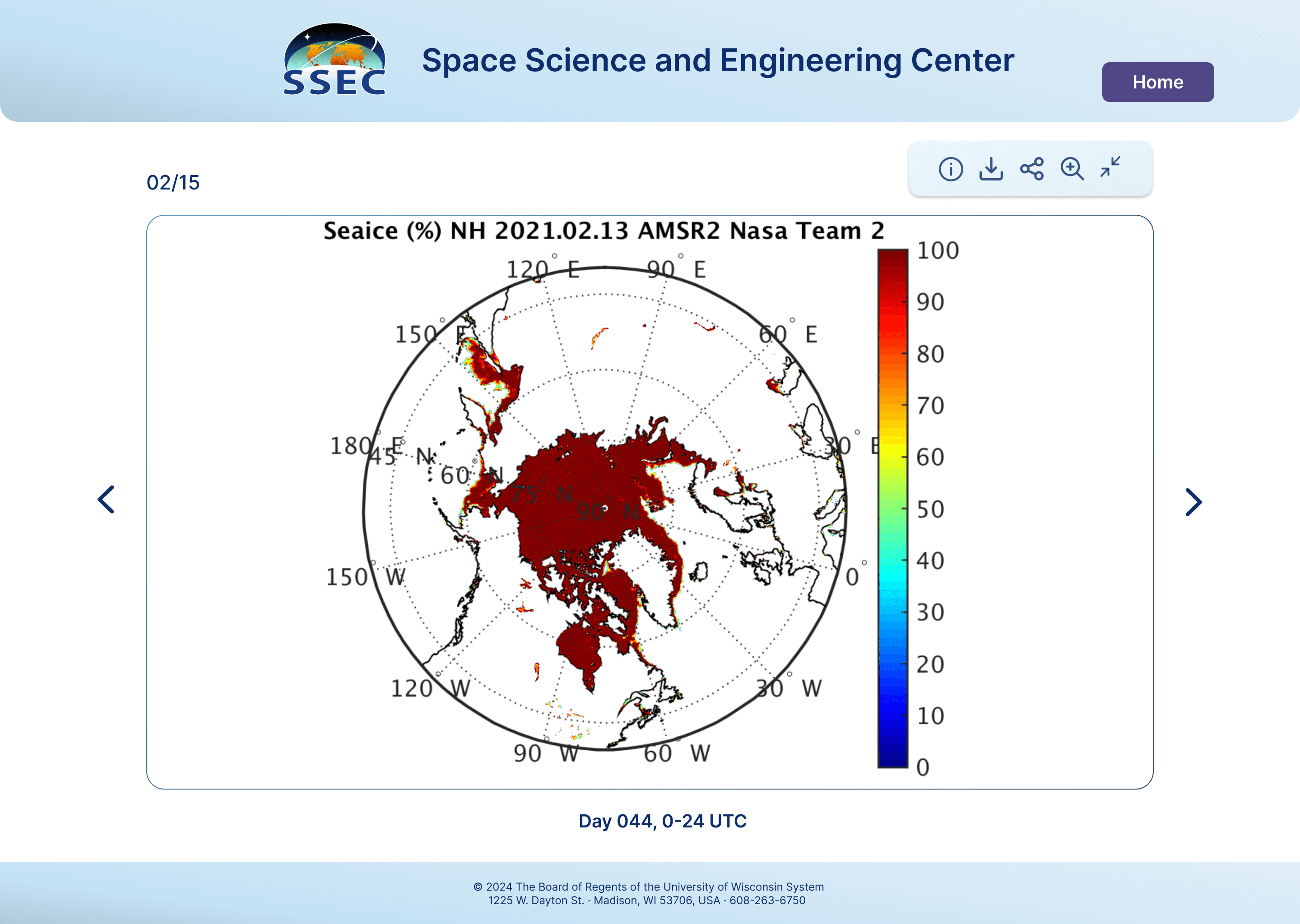
Clear visualization and customization
- Clear visualization of images produced by the instruments.
- Options to share download and zoom available for efficient synthesis of data.
- Configuration options available to assess the exact data scientists want to.
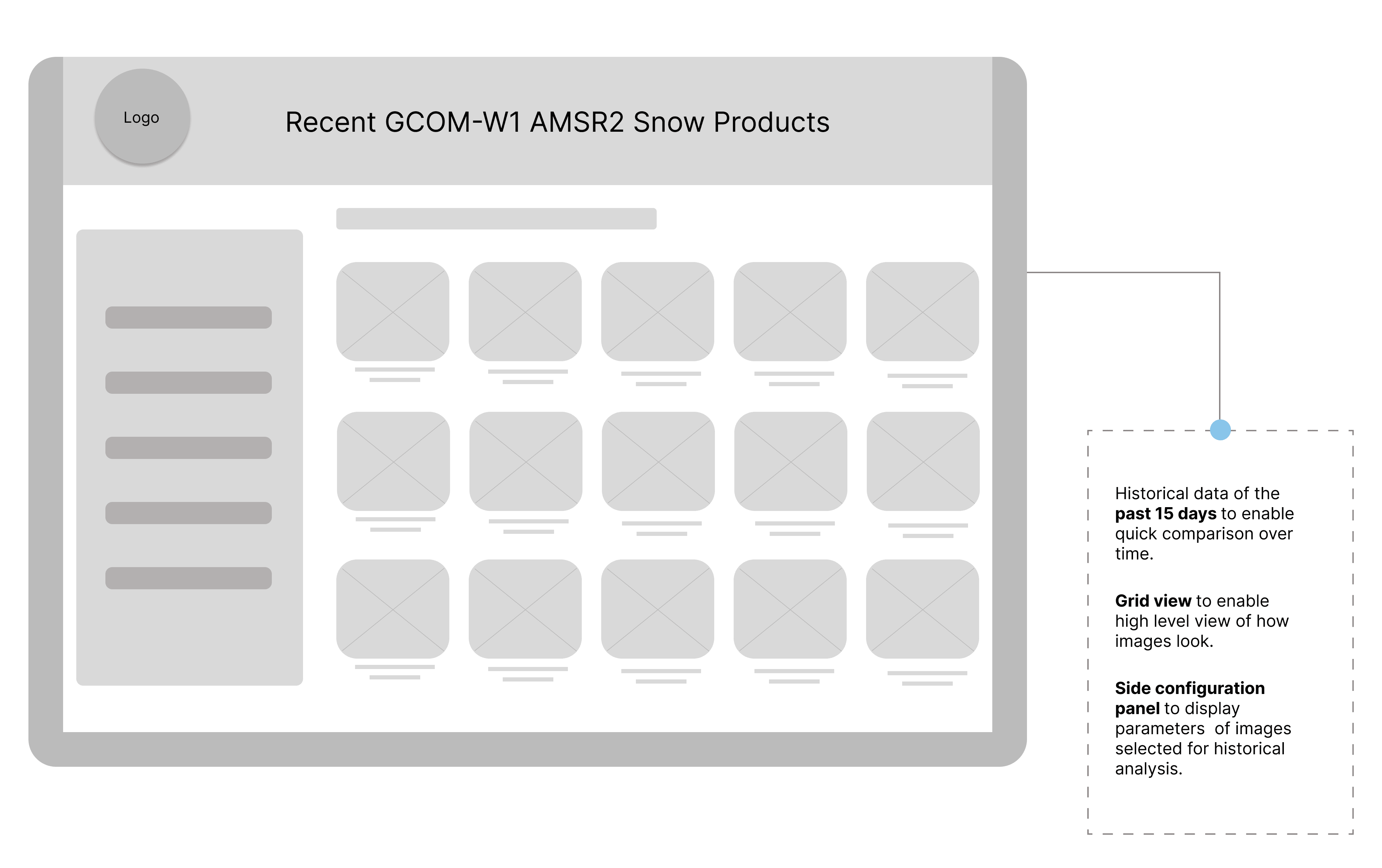
Historical data for study and analysis
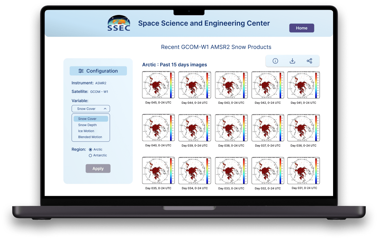
- Recent 15 days images available for studying past data.
- Grid view of the past images to assess climate patterns for snow and polar winds.
Research
User Interviews
To better understand the needs, pain points, and current workflows of the scientists at SSEC, I conducted user interviews with five scientists who regularly work with snow, ice, and polar winds data. The objective was to uncover challenges they face in accessing and analyzing satellite data, as well as to gain insights into their expectations for an improved data visualization platform.
Interview Questions
- How do you currently access satellite data for snow, ice, or polar winds?
The goal here was to understand the tools or processes used to gather data and their efficiency.
- What challenges do you face when comparing data from different satellites, regions, or timeframes?
This question helped identify pain points in their data comparison methods and the limitations of the tools they currently use.
- What features or functionalities would make the process of exploring and analyzing climate data easier for you?
This question was crucial in gathering their expectations for the new platform—what they wished for but didn't currently have.
- Are there any specific tools or platforms you've used that you found particularly useful or limiting?
This helped in benchmarking the current platform's usability against competitors like NOAA and NASA.

Research
Competitor Analysis
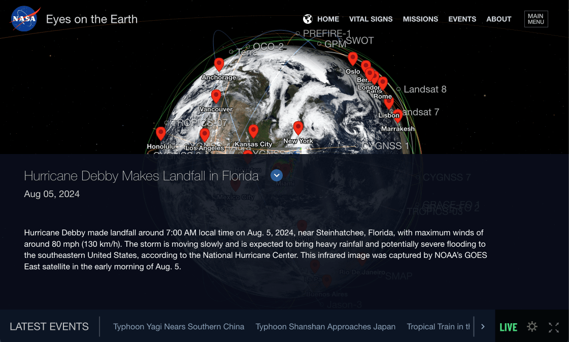
NASA's Eyes on Earth
This interactive app allows users to view different environmental phenomena across time and locations, with a 3D global visualization.
Pros:
- Visual Appeal: The interface is highly visual and engaging, making use of 3D imagery and real-time animation.
- Interactive Features: Users can zoom in and out, explore global events, and watch animations of environmental changes.
- Wide Coverage: Provides a global perspective on climate events.
Cons:
- Complex Navigation: Navigating through layers and events requires a learning curve, which may be inefficient for busy researchers.
- Limited Filtering Options: It doesn't allow users to filter data based on specific variables like snow, ice, or polar winds - crucial for climate scientists in polar regions.
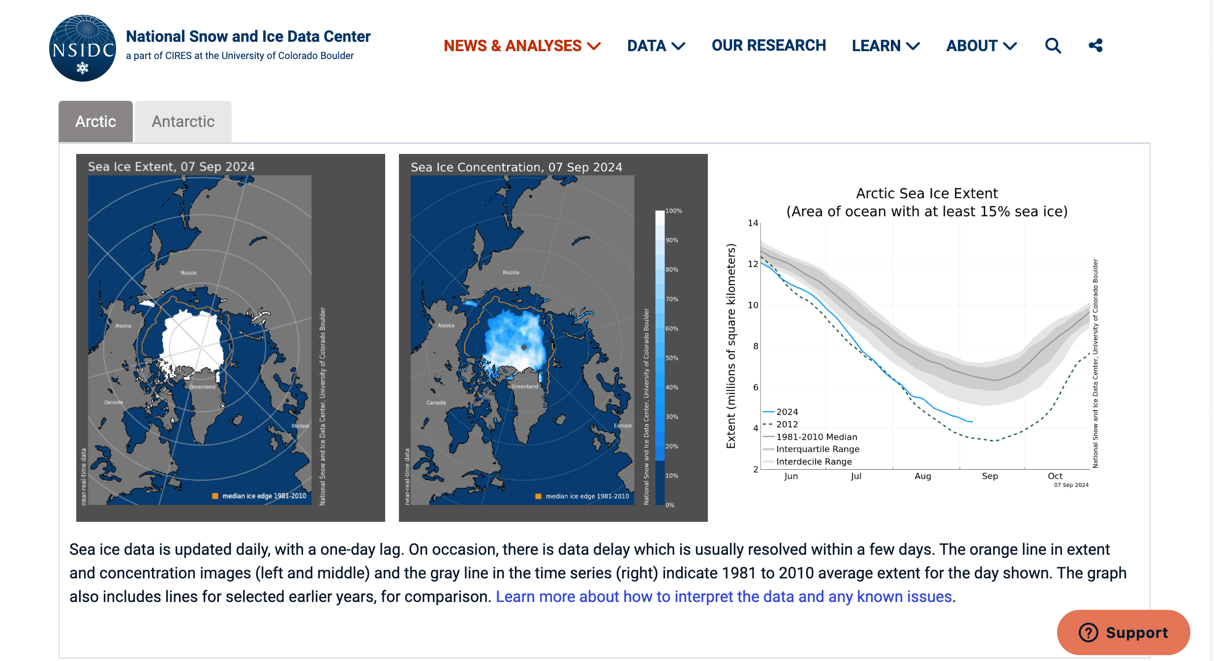
NSIDC's Sea Ice Today
NSIDC's "Sea Ice Today" provides a more data-centric approach for tracking Arctic and Antarctic sea ice. It presents real-time and historical data on sea ice extent, charts, and downloadable data sets for in-depth analysis.
Pros:
- Data-Rich Interface: The website focuses on providing scientifically accurate, up-to-date data.
- Downloadable Data: Researchers can download data for offline analysis, which is critical for long-term research studies.
Cons:
- Limited Interactivity: The platform lacks interactivity, with static graphs and charts dominating the interface.
- Lacking Historical Data: While informative, the interface lacks historical data with the ability to view trends over time.
Research
Generating Insights
By diving deep into the scientists' workflows and pain points, I was able to gather actionable insights that shaped the direction of the platform's design. These interviews were invaluable in ensuring that the final product would meet the scientists' current needs and remain scalable for future data products.
Difficulty in Navigating Data
The scientists shared that it was often challenging to find relevant images quickly.
Need for High-Resolution Images with Zoom Functionality
Being able to zoom in and out was identified as a crucial requirement to thoroughly study climate patterns.
Inefficiency in Comparing Data
They wanted a more streamlined comparison feature that allowed them to easily analyze trends and changes in the data.
Preference for Variable-Based Categorization
In the beginning of their user journey scientists know which variables (snow, ice, polar winds) they want to study and then select other components.
Sharing and Downloading Data
They need the ability to easily share high-resolution images with colleagues and download them for further offline analysis.
Research
Defining the Problem
After conducting user interviews, performing competitor analysis, and studying the current process, I framed the HMW statement to define the problem.
How might we allow scientists to efficiently navigate, compare, and analyze snow, ice and polar winds data across different timeframes and regions.
Synthesis
User Persona
I created this user persona to represent the primary user of the SSEC Products Platform based on extensive research and user interviews. Dr. Lee's profile embodies the needs, frustrations, and expectations of scientists working with satellite data for polar and cryospheric research. By synthesizing these insights, I aim to design a platform that optimally supports the scientific community's data visualization and analysis needs.
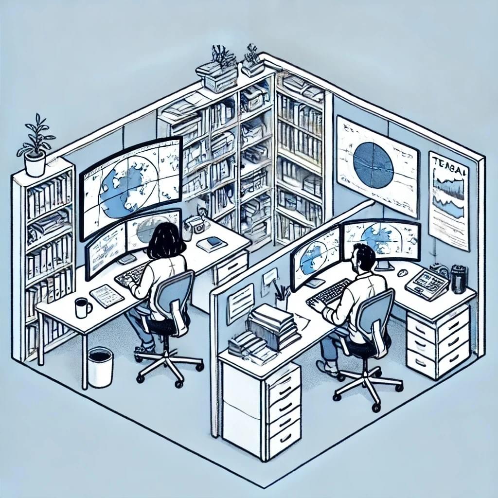
Dr. David Lee, 58
Dr. David Lee is an esteemed scientist specializing in polar climate and cryospheric observations. As a senior research lead, he focuses on developing advanced methods to observe polar regions from space. His work has greatly contributed to understanding polar climate changes and expanding cryospheric data globally. He has led international research collaborations and is currently part of the World Meteorological Organization's Cryosphere and Polar Observations Team.
Frustrations
- Difficulty in navigating and comparing vast satellite data stored in scattered server folders.
- Lack of an intuitive interface for configuring specific datasets across different satellites, time periods, and regions.
- Challenges in sharing data with global collaborators quickly.
Needs and Goals
- A unified platform that simplifies accessing and visualizing large volumes of satellite data.
- High-resolution imagery with advanced zoom-in/zoom-out functionality for detailed climate studies.
- Seamless options for comparing data from different time periods and geographic regions (Arctic vs. Antarctic).
- Easy download and sharing features to support international collaboration.
Emotional State
Synthesis
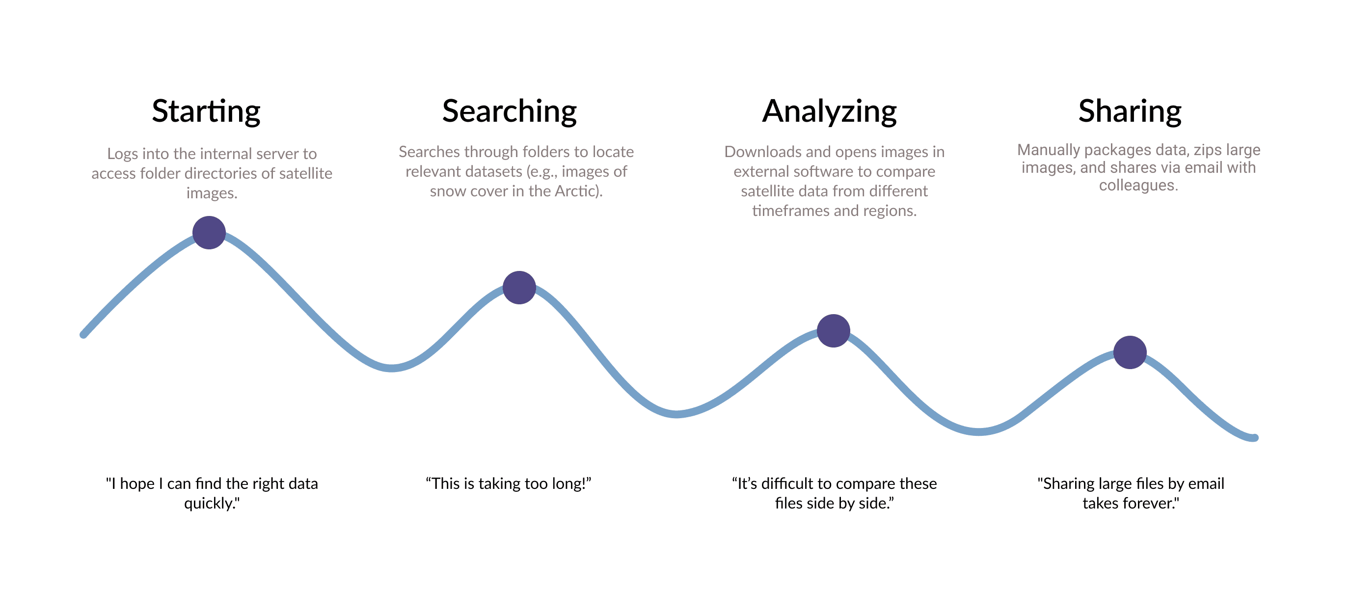
User Journey
I created this user journey to illustrate how Dr. David Lee, a lead scientist at SSEC, navigates the current manual process of accessing and analyzing satellite data stored in folders, before the new platform is developed. This journey focuses on the emotional highs and lows as Dr. Lee manually searches, compares, and shares climate data, emphasizing the key pain points and inefficiencies.
Dr. David Lee
As a senior climate scientist, I need to analyze polar satellite data manually stored in various folders and shared through outdated processes, which makes it difficult to compare, analyze, and collaborate efficiently.
Ideation
Developing a Solution
With the goal of creating a unified platform for accessing, navigating, and analyzing polar climate data, I designed the SSEC Products Platform to address the unique challenges faced by researchers. This platform simplifies data access for scientists studying snow, ice, and polar winds, offering a user-friendly interface to handle both current and future data needs.
Redesign Goals
- Help scientists operate from a unified web platform to access climate data.
- Easy to use configuration panel to filter images based on satellite, region, date and parameters.
- Allow flexibility for future product additions like sea ice.
- Zoom in and share capabilities for the curated images from all satellites and instruments.
- Able to compare images based on regions (Arctic and Antarctic) and time.
This solution provides a clear and scalable method for accessing vast amounts of data, allowing scientists to focus on their research rather than struggling with data navigation.
Ideation
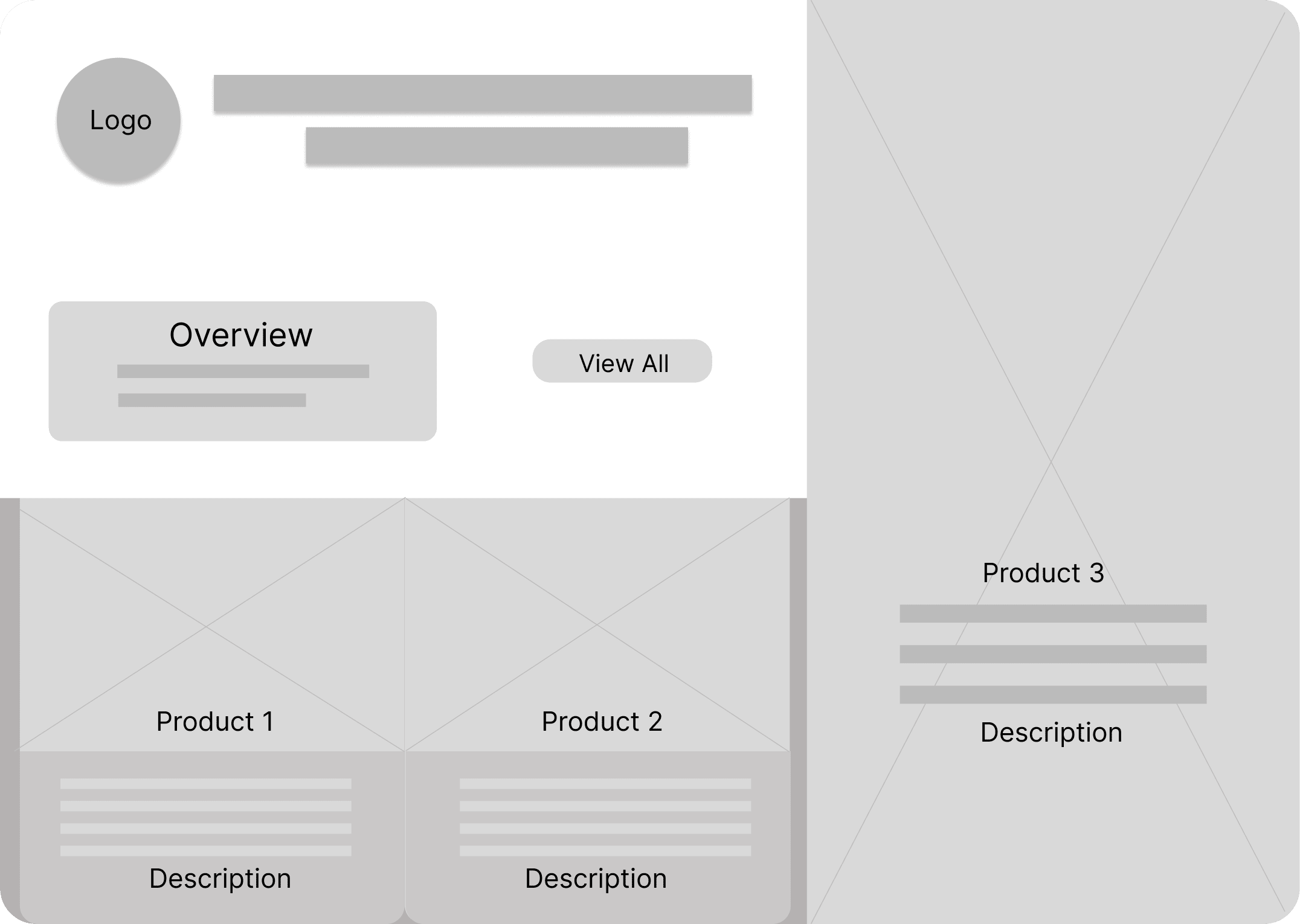
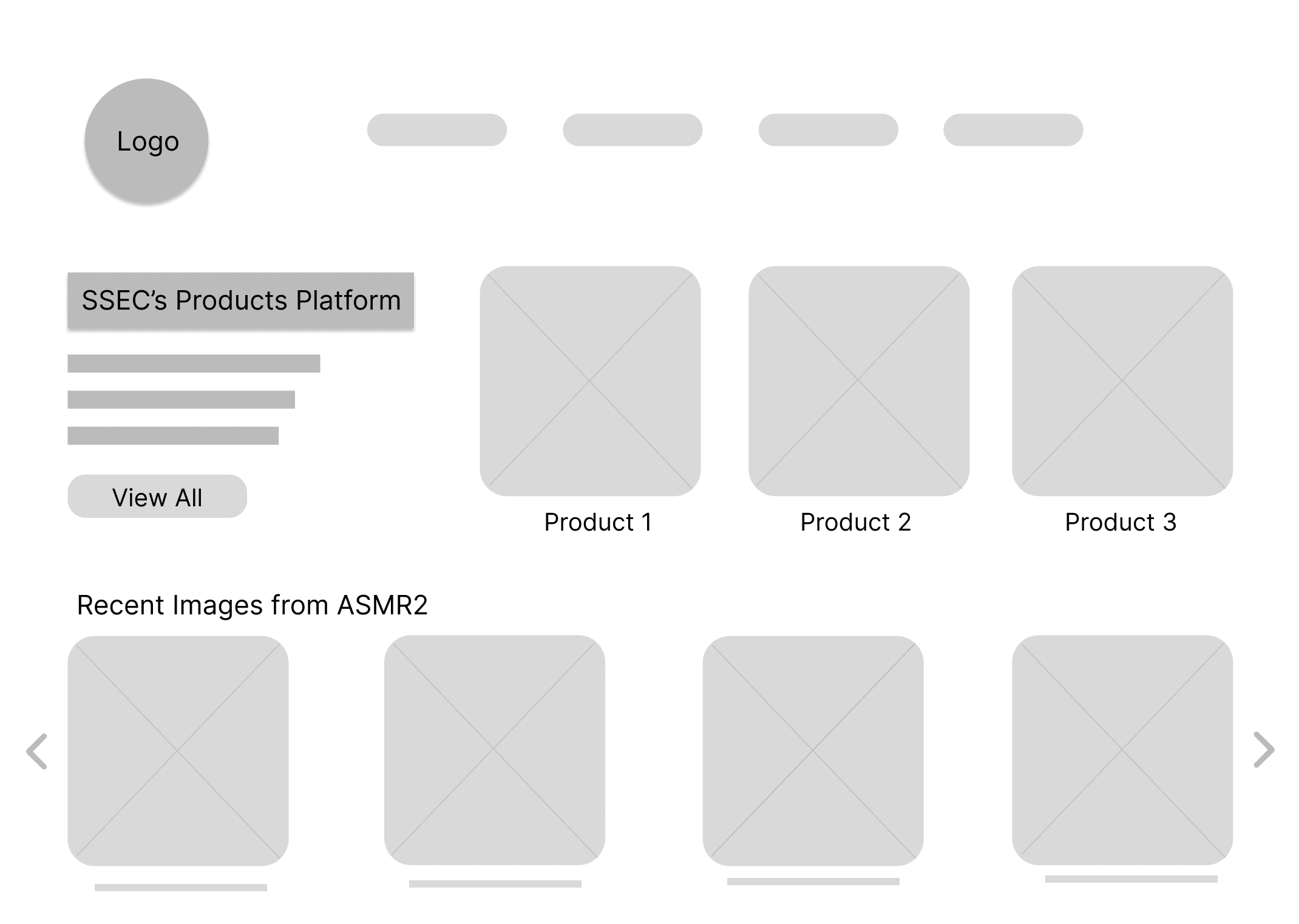
Screen Designs
Here are some of my screen designs regarding my research and the goals for the web platform. These screen designs provided us with the initial thoughts about how the platform could potentially help in alleviating discovered pain points.
Ideation
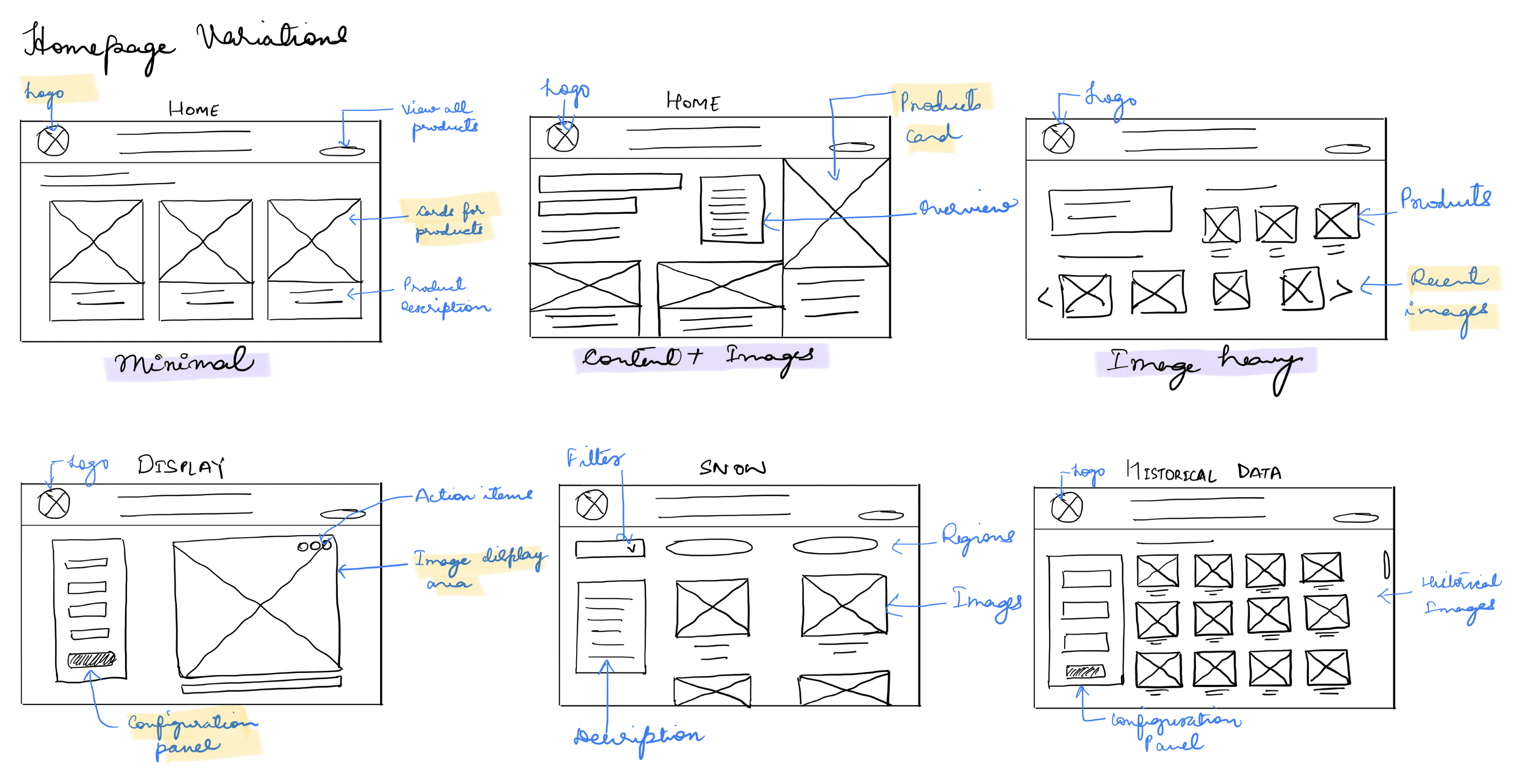
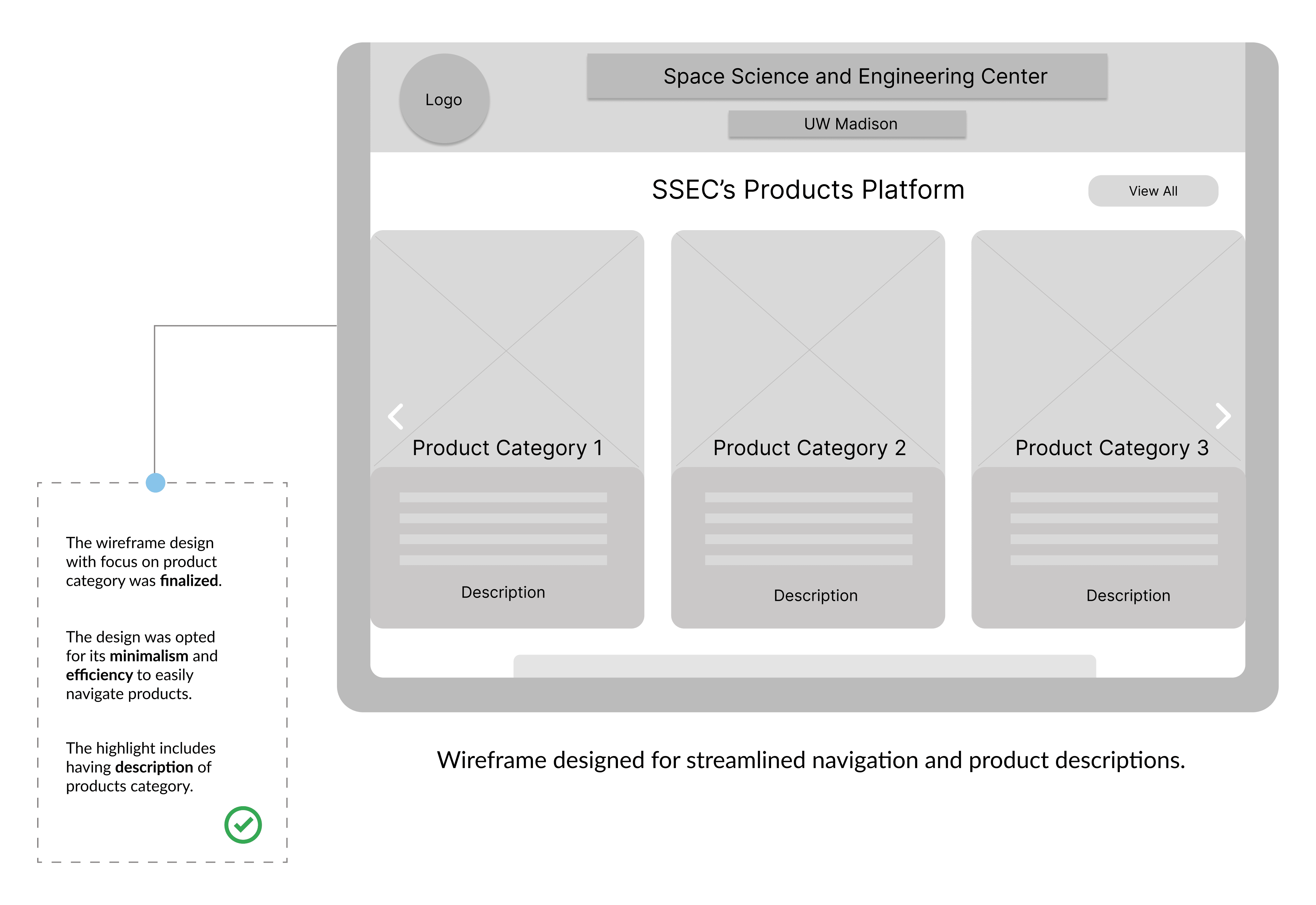
Wireframes
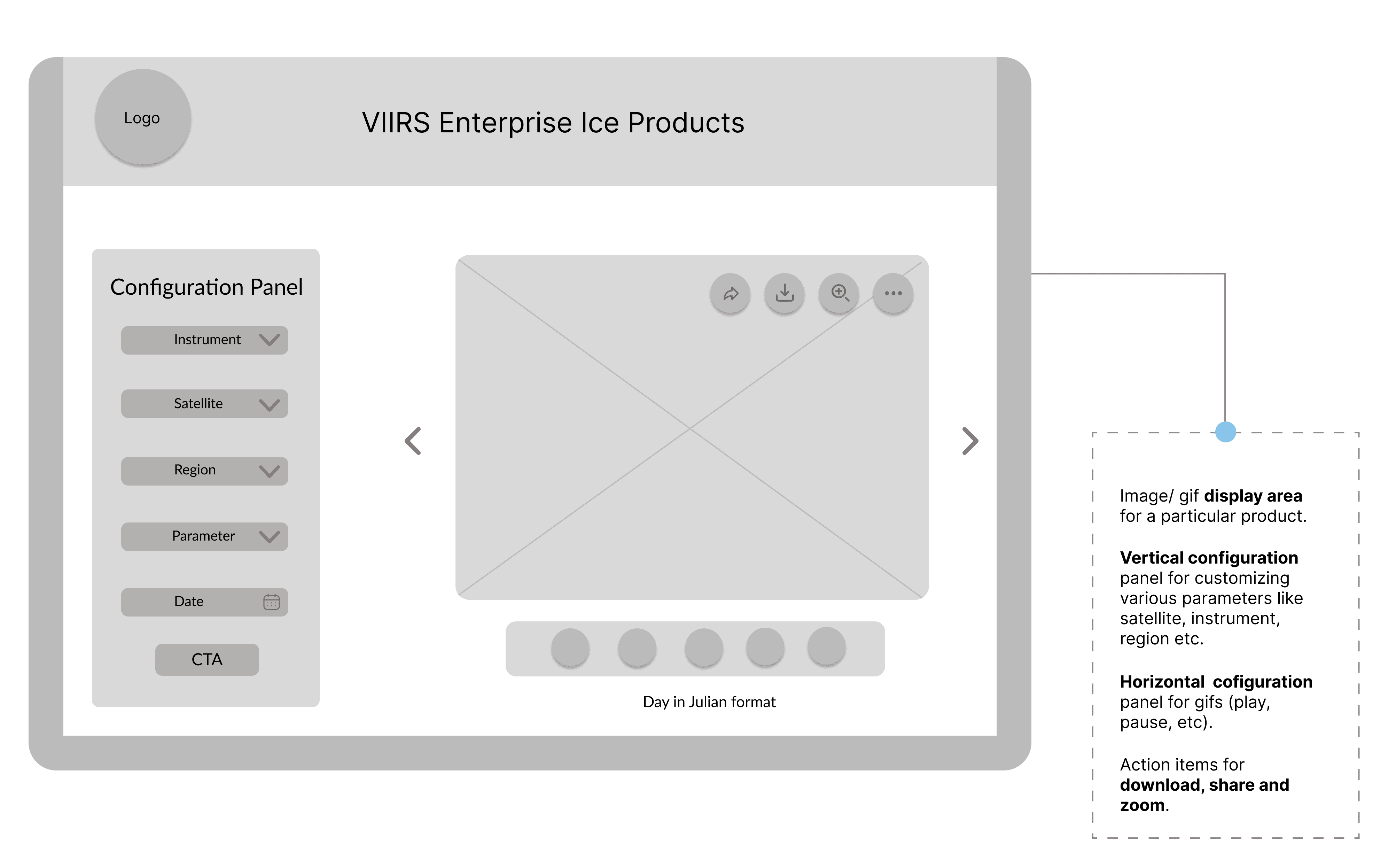
After sketching the screen designs, I proceeded with crafting the wireframes for every page. Initially there were multiple variations of some screens like the homepage. After discussion with the team and few iterations, wireframes were finalized for screens based on how well the design best suited the team requirements. Below are the annotated versions of main screen of the web platform for scientists.
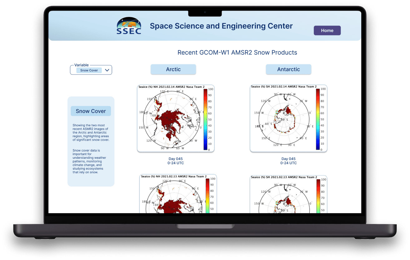
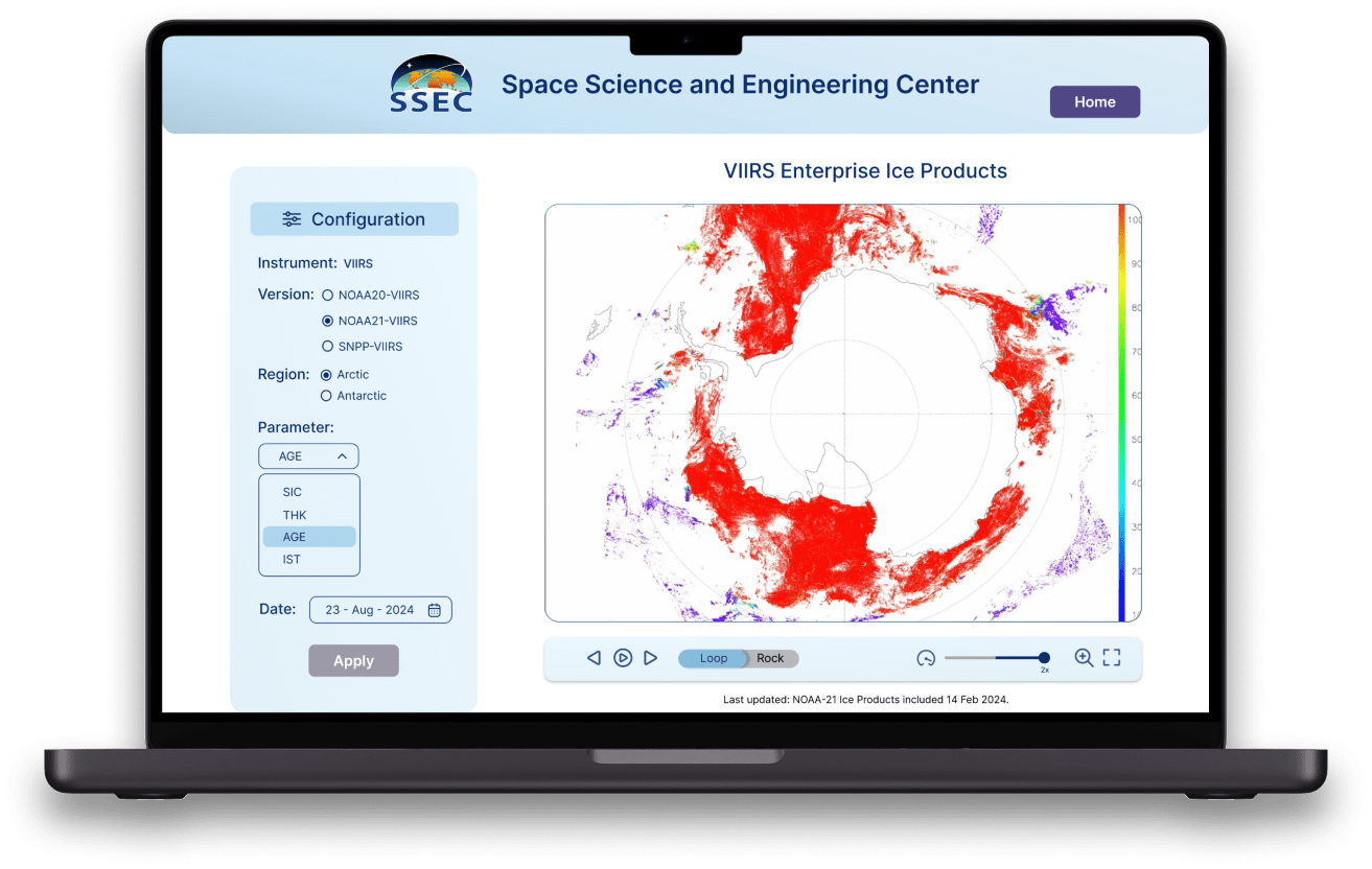
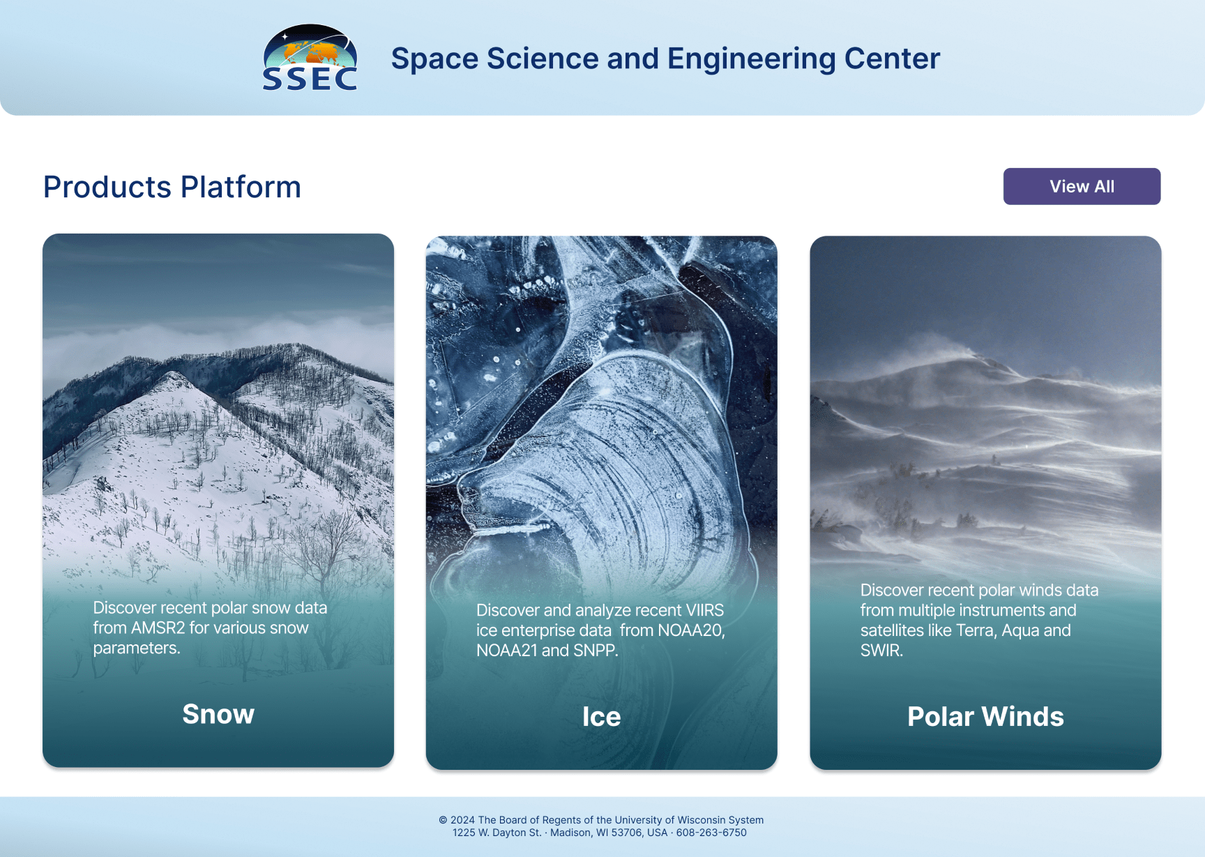
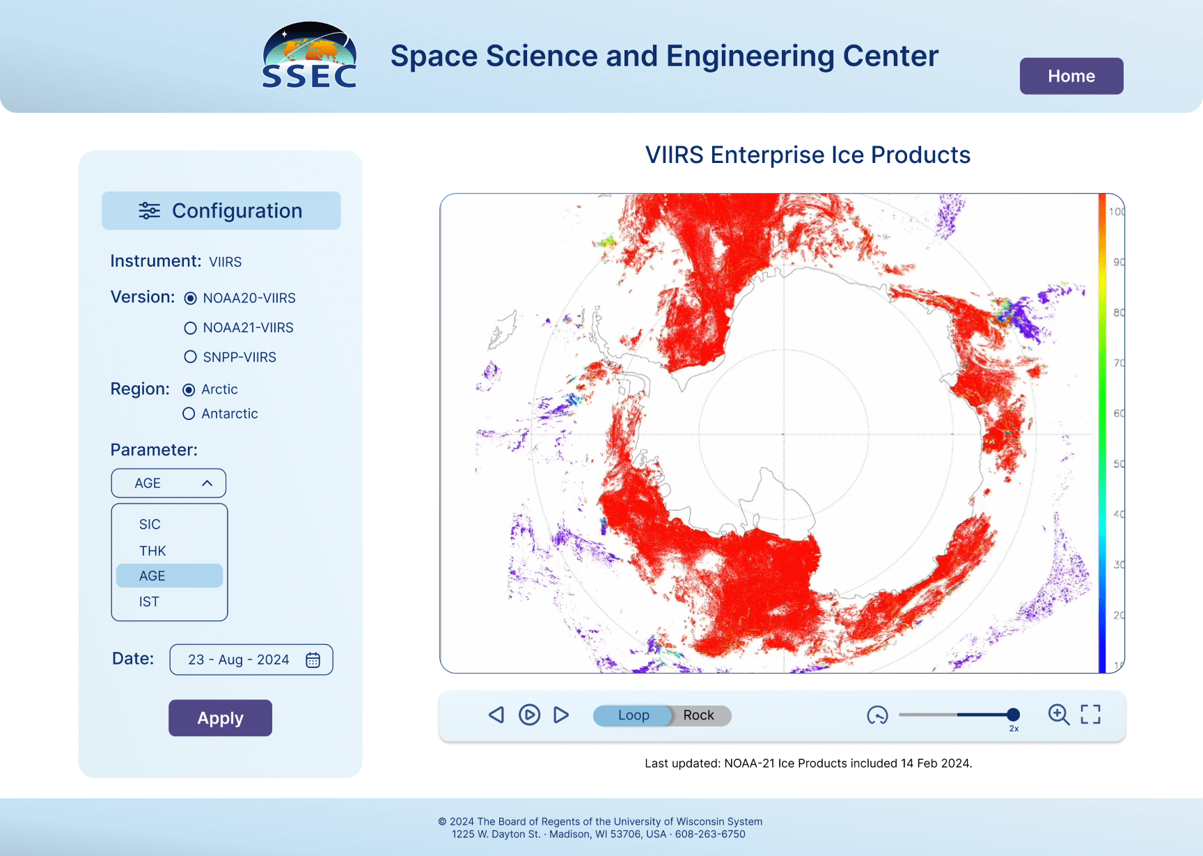
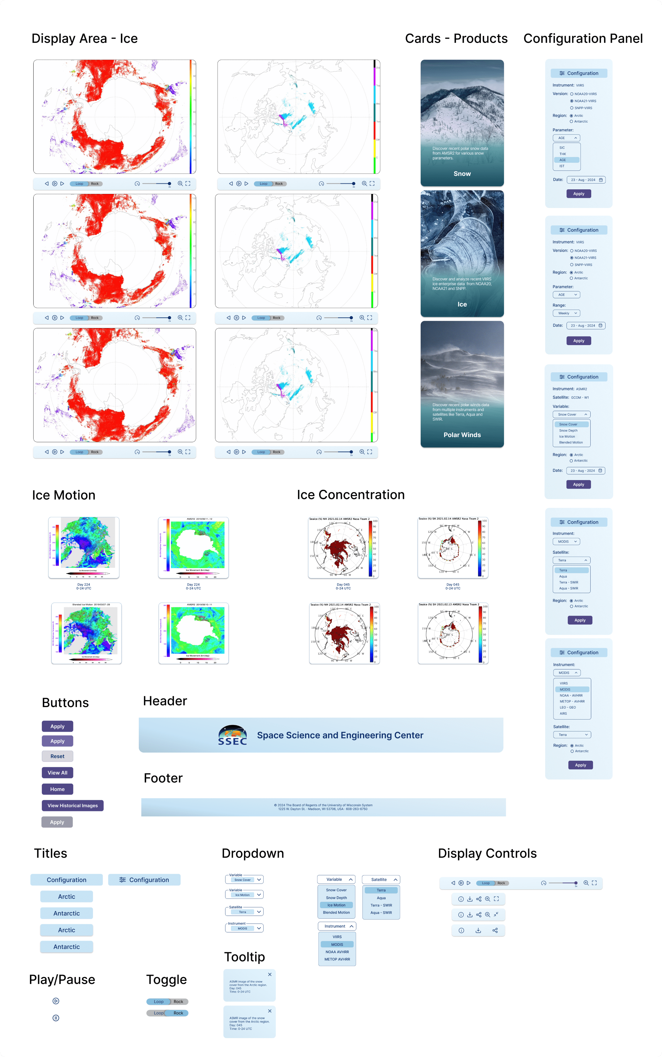
Final Designs
Final Screens
High Fidelity Prototype
Throughout the design process, my goal was to create a seamless and efficient experience for SSEC scientists.
- After user interviews and team discussions, I transitioned to high-fidelity designs to bring the platform to life.
- The platform was visually consistent with high-resolution image support and easy zoom-in/zoom-out functionalities for scientists to compare and analyze satellite data.
- These final designs became the backbone for the development phase and were featured prominently in internal presentations, showcasing the platform's potential and impact on climate data analysis.
Below are some of the final UI screens of major pages concluding my user research and design iterations. These high-fidelity concepts were crafted with a user-first approach, balancing functionality with an intuitive, modern interface.
Final Designs
Design System
Once the screen designs and wireframes were completed, I focused on building a cohesive design system to ensure consistency and scalability across the platform. For the color palette, I chose cornflower blue as the primary color, symbolizing snow and ice, with ming green as the secondary and violet as an accent. These colors reflected the platform's connection to climate data while maintaining a clean, scientific aesthetic. The typography selected was Inter, a modern and legible font, chosen for its versatility across different devices and screen sizes.
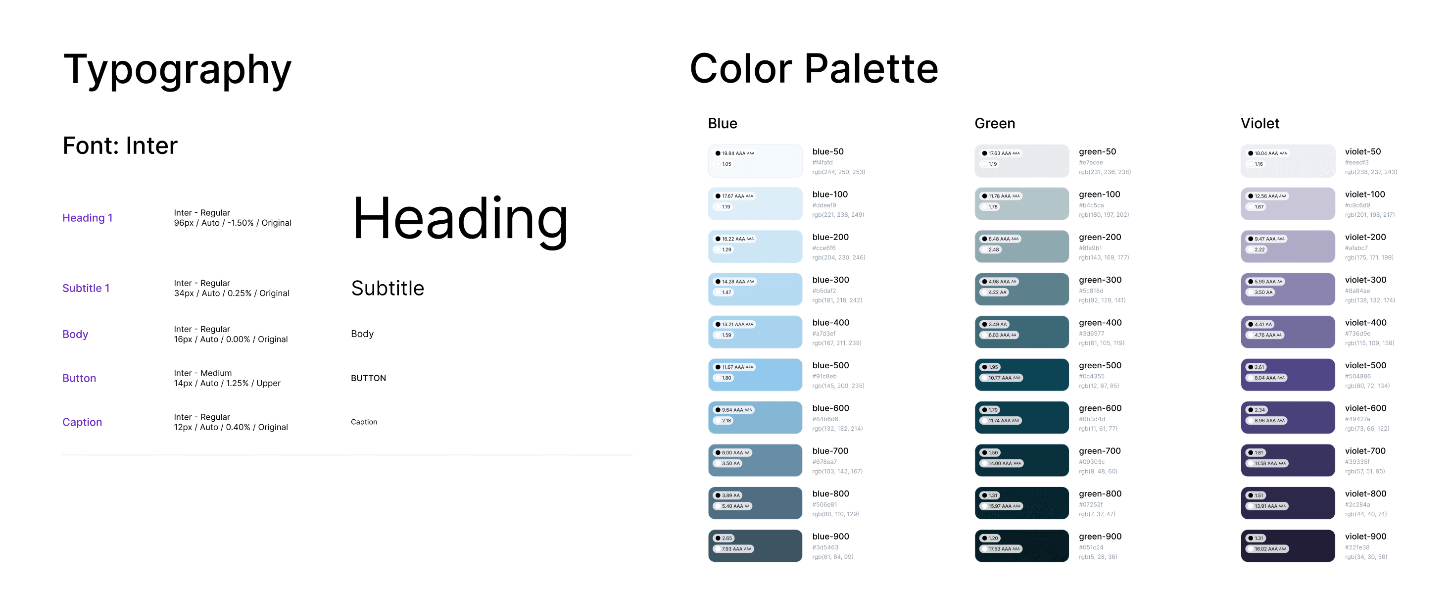
To streamline the process, I built Figma components and variants for all UI elements, including cards, buttons, and dropdown menus. This component-based approach allowed for efficient design updates and ensured consistency across the platform, supporting smooth collaboration between design and development.
This design system provided the foundation for a scalable and user-friendly interface that aligned with the platform's goals and scientific purpose.
Reflection
Learnings
This project taught me the importance of user-centered design and the value of continuous feedback and iteration. Understanding the specific needs of the scientists and involving them throughout the design process was crucial in creating a platform that truly met their requirements. In the future, I would focus even more on usability testing early in the design process to quickly identify and address any potential issues.
Reflection
Next Steps
If I had more time to continue working on this platform, there are several key areas I would focus on to enhance the user experience even further:
- Integrating Web Accessibility: I believe accessibility should be at the core of any web design. Going forward, I would prioritize making the platform more accessible by implementing features like screen reader compatibility, improving keyboard navigation, and ensuring proper color contrast.
- Usability Testing and Evaluative Research: While I had valuable team meetings during the design process, I recognize the importance of conducting more in-depth usability testing. I would set up usability tests with the scientists who use the platform, allowing me to observe how they interact with the tool and pinpoint any usability issues. This kind of evaluative research would provide invaluable feedback that could be used to fine-tune the user experience and make the platform more intuitive.
- Expanding Comparison Capabilities: Right now, the platform allows for comparison of only two datasets at a time, focused on regions like the Arctic and Antarctic. If I had more time, I would work on expanding this functionality to allow for comparisons across more than two datasets, covering different regions and timeframes. This would provide scientists with more flexibility in analyzing trends and making data-driven decisions.